You'd think its the basic commercial of natural goodness finding its way into Bavaria beer and fulfilling its destiny... yet it has a twist... it shows the natural goodness of the beer and its funny brand identity through the comical ending. Something as small as the ending change wins over a consumer... hence teaching me that ads should be funny and simple (well where appropriate at least.)
Friday, 20 May 2011
Saturday, 7 May 2011
Mercedes "Sorry" Ad
Probably one of the few car ads that actually has a story to it instead of just the car zooming around a road and showing off its driving. Here the breaks of the Mercedes has a unique selling point of better and faster breaking, where they successfully portray this by having a climax point of the man about to crash and breaking in time. If the ad ended with only this, then the drama of it would probably not be enough to shock the viewer. Hence the grim reaper is added to make the ad funnier and unexpected.
Dairy Milk - A Glass and a Half Full of Joy
"A glass and a half full of joy" was the brief for this ad, hence the ads are simply filled up with joy, giving you the same feeling that a Dairy Milk chocolate would give from its first bite. Throughout both ads the purple colour of the brand is seen, reminding the viewers of the product. This small detail is extremely important as the product isn't really seen until the very end of the commercial, hence some kind of reminder needs to be provided within the video. This campaign is simple, happy and funny and also can extend to a very wide campaign as the brief is simply about joy.
Ogilvy and Mather - Dove Evolution
We've probably all seen this ad by now, but even if it was still aired it probably would never get old simply because there aren't enough of these types of "eye openers" about todays media and our perception. This ad is part of the "Real Beauty" campaign by Dove where they use REAL women with what media today perceive as "flaws" (ex: a little bit of extra weight, a lot of freckles and even something as unavoidable as age.) Dove was the first company of its kind to risk using real woman and showing their products are made for the average female (and males too) rather than the models we see in TV. Their best idea was to simply base their ads on the truth, and use what everyone sees in real life. Finally we can have girls look up to Dove ads and natural beauty rather than the Photoshoped models they get bombarded with every day.
Heineken commercial
The ad leaves it to the very last moment to give its audience a twist in the story, telling us that the taste and quality of Heineken is enough to lure in other life forms. The creative strategy used is obviously exaggeration, a very popular technique to show the qualities of the product. In this case, Heineken doesn't really have a unique selling proposition (no strong taste, no increase in alcohol, etc.) It simply says "we're the best" and the ad serves as proof.
Honda Choir Ad
We've seen the same "wooshing" and "vrooms" of cars for years now, and they all seem to be the same. However when presented in a unique different way, suddenly the car sounds become interesting. Here we can see a choir singing the sounds of the Honda. Technically, they're the same as any other car sounds that we here in many ads, and even the ordinary cars on the streets, however the audience actually gets a feel of different weather, roads and steering. The advert visualizes different scenarios and has us experience the drive of the car and hence, want to buy it.
Wednesday, 4 May 2011
Diesel - Be stupid


The most genius campaign I've seen in a while. The healdines are witty, thought through and original, showing why Stupid is better than Smart. These characteristics are also personified to be like people competing with each other with visuals of fun, care free, loving and living life people showing why "stupid" is better.
The variety that Diesel has provided is fascinating, having videos on their website and branching off to multiple medias and bringing in more clients because of such a big campaign. Also the different headlines further persuade the viewer that being stupid is better than being smart, as each headline is different and backed up with more and more pictures.
Overall you may think what stupid has to do with Diesel. This is simple as Diesel's identity is to be loud, care free, creative and loving life, which is the way they describe "Stupid." And of course not forgetting the slogan " be stupid" further relates to the campaign.
To see more of the ads click on the link below:
http://www.creativeadawards.com/diesel-be-stupid-advertising-campaign/
Two cool car ads

Mini Cooper Ad
Today we all know what a Mini Cooper looks like, so there's no need to show the car in the ad (unless its a new release or something.) So taking its USP of being small, Mini has shown this in a funny way, having a hitch hiker crouching down to flag over a Mini. Additionally, after a laugh or a smile form the ad, personally I started thinking about how silly it would be for someone to actually do this and wait for a Mini to drive by (rather than getting in the first car that pulls over.) This simply shows the desire of Mini's and the want to be seen in an expensive car.


Porsche Ad
The obvious USP here is the speed of a Porsche. This ad made me look twice as initially I didn't understand it (until I glanced at the logo.) The creative strategy here is exaggeration, having certain things fly faster because of the car and stab different objects along side the road. What I also think is successful about this ad is that just like the Mini it doesn't show the car. It focuses more on being creative and pleasing their clients eye, rather than getting new clients in by showing the flashy cars (although it could be argued that new clients would be lured in by creativity of the ad which would link to the brand identity, rather than the look of the car.) Another difference to many car ads is that the posters are illustrated rather than photographed. It looks extremely realistic, however there is something that shows more of a fantasy realm rather than the real roads. And of course this is intentional as this implies the fantasy realm of clear highways and lovely landscapes you enter with a Porsche.
condom shop - don't be stupid


Here Condom shop advertisers take the phrase "don't be stupid" and show it in a different, obvious way. Rather than telling teens to use a condom because of sexually transmitted diseases (what they already know,) here we see how the advertisers underline how not using a condom is stupid, linking it to being the same as being naked and putting out a fire, or having no bullet proof vest in the army.
Moving away from the constant lectures of STI's and showing the problem in a new, stupidly funny way, teenagers are more likely to relate to this and listen (humour is always a good way to lure in an audience.)
Personally this ad is more appealing to males rather than females (which is understandable as males tend to be more oblivious to sexual problems) however the campaign can easily be transferable to females as well. For example (off the top of my head) a woman putting on lipstick and driving off a cliff, a girl having a set of dolls and one showing some sort of symptoms, a secretary putting her hand through a shredder, a business woman turning up in her Pajamas in a courtroom, etc. Obviously these are only ideas and would need to be worked on, however its only shows that the ad could be linked to all genders.
United Nations World Health Organization - Fabrica


The creative strategy used here is associated props. Seeing as showing actual pictures of children getting burnt or run over would be banned as being too shocking for society, Fabrica uses clay/play-do figures to represent children getting hurt as a result of their curiosity and carelessness. The positions and facial expressions only further make the ad eye catching as our audience straight away thinks of their children in the clays place. The world health organization give a statistic of how many children die from these accidents and advice on how to prevent this. The images are still shocking, which is another creative tactic the advertising company uses, however it is withing the boundaries of acceptable for society. Additionally such shocking imagery makes our audience want to actually read the copy (very rare in todays day and age for individuals to take the time to read something) as this is a major worry of all parents (keeping their children safe.)
VW - Grabbarz & Partner Werbeagentur GmbH
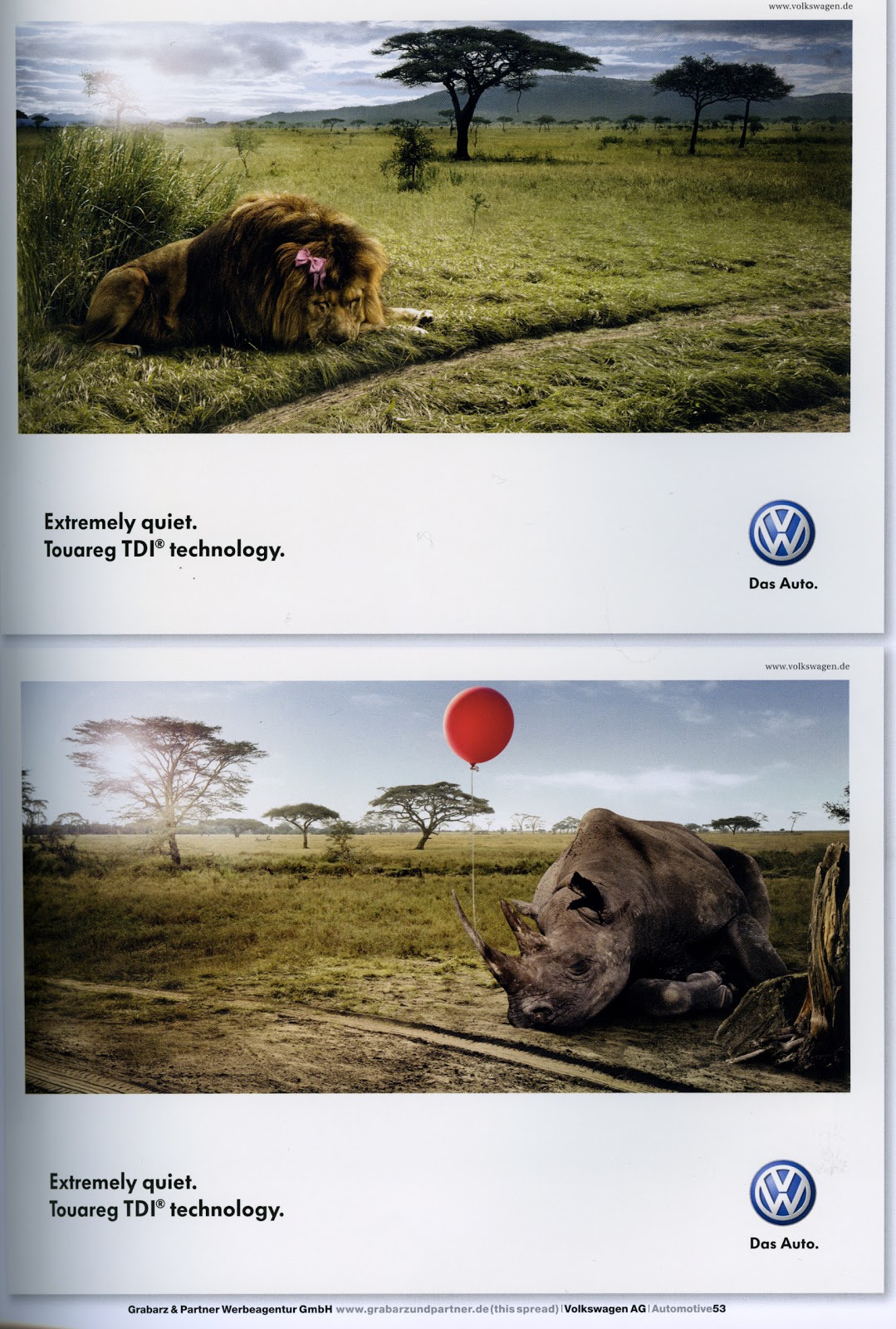
This VW ad caught my eye because it uses a technique which many car brands fails to achieve of simply don't know how to create: not showing the product (car) in their ad. Today we are bombarded with car ads which don't really stand out more than their competition because they all show the fancy car in the beautiful landscape driving around perfectly. Of course, not showing any relationship to a car would be stupid, as then the audience wouldn't know what the product is at all, therefore simple tire tracks were added and a logo was placed to show the type of vehicle.
This advert targets VW cars in general, showing them as "extremely quiet" (this being there unique selling point.) The ad speaks for itself, however I would like to underline that the way they show the cars quietness is through love and care which further implies that this car is for families and couples who care about safety, calmness and stability.
Jail house fire - Pyper Paul + Kenney

I chose to share this as because we had a similar project in class to advertise "super hot" hot sauce. All hot sauce have one creative strategy, which is that they are "the hottest." So how can they succeed in advertising the same unique selling proposition as their fellow competition? I looked into exaggerating the hotness (individuals having shocking third degree burns from touching the bottle or having it served in a wine chiller as its so hot.)
Pyper paul + kenney came up with similar brilliant creative strategies. The unique target was the name: "jail house fire - creased with conviction" which is then linked with the USP (unique selling point) of being extremely hot. They took the creative strategy of exaggeration, and exaggerated this sauce to be so hot that it is extremely dangerous and almost lethal. The campaign focuses on crime investigation scenets (beause of the prison associated name) and warns the viewer to "handle with care" or "do not cross our hot sauce line" unless ready, etc.
The print of this ad is a well written copy. It links and makes the visual even stronger with its witty remarks such as " Be glad your tongue has over 10000 taste buds because you'll need every single one." The statements are based on true, interesting facts, and used in a way that shows the hotness of the sauce with black humour.
Even though the print may not be read (unless placed in a magazine, as otherwise the 3 second rule does not apply) the slogans and taglines such as "Brutally Beating Tabasco Sauce" "It's so Lethal" Open at your Own Risk" and Murder on your Taste Buds" will still be enough to understand the ad and further underline its USP, as the text sticks out with its crude typography and the phrases are catchy and memorable.
The posters have a lot going on, however they are more or less easy to read and view because of its visual hierarchy. The main visual is centered, hence catching your eye first, and then you notice the taglines crudely written and drifting off towards the product image itself. Only then if you're further interested you read the small print. These ads could work both without the print (if it was a poster) and with the print (if it was in a magazine or bus shelter.)
Intersnack - Heye Group GMb

This ad caught my eye because of its visual composition. The huge tanks of beer and mojito's obviously catch your eye, especially the audience of a young adult (as this would be a perfect party idea.)
Obviously a fish tank is used to underline the form of the product and shows a switch between the two, having liquids in a fish tank (rather than in a glass on the table) and the fish crackers on the table in their bag.
The slogan also works in two ways. "Cracker" being the actual product as well as the "starter" of the party, convincing young adults that they need this product to have a successful, fun night out.
Overall a simple ad, yet witty. The idea is genius, however the composition simple and easy to look at, which only further makes the ad successful as if it was crammed, our easily distracted audience (approx 18-25 year olds) wouldn't even bother looking at it.
Counting Sheep IKEA
IKEA Advertising - Instinct Advertising Company
http://media.advertology.ru/2007/04/02/ikea_line.wmv
(to see the whole campaign look at the link below)
http://www.sostav.ru/news/2007/04/02/r3
Although the "counting sheep" ad may have been overused in many countries, this is the first of its kind in Moscow, proving that creativity is starting to bloom in this country.
The ad is different to many of the "counting sheep" ads because it uses live sheep rather than animations. This small change makes it even more humorous as the ad focuses on reality and makes the viewer fantasize about sheep flying through the air and coming to their bedside as a live situation. This additionally makes the ad stronger as the viewer connects to the individual lying in bed more than they would with an animated person and sheep (especially because we are talking to an older audience.)
Subscribe to:
Posts (Atom)